Re-imagining Mock The Week
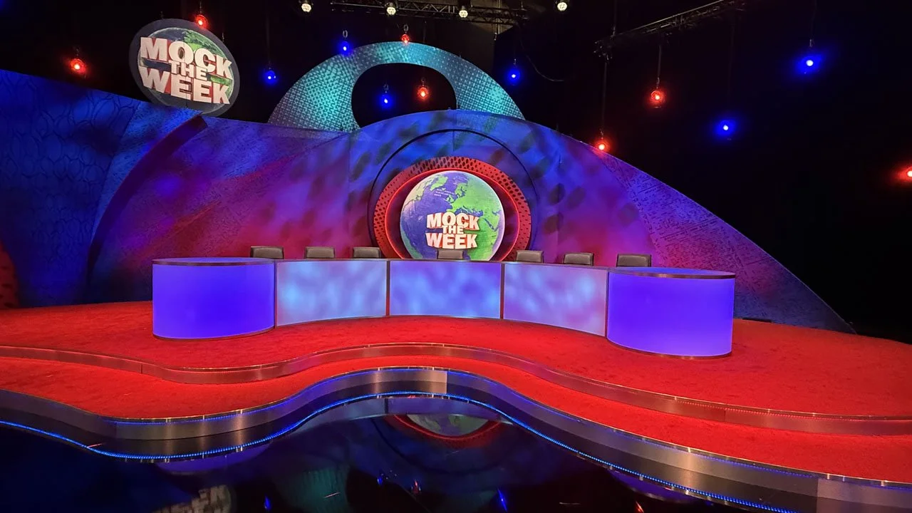
How I refreshed a 20 year old iconic studio set
The move from the BBC to TLC
In November 2024 Mock the Week finished its almost 20 year run on the BBC.
But in Feb 2026, Mock the Week returned to its new home on TLC.
The set design
The brief was to retain the look and feel of the previous shows, while giving the set a subtle update and a more contemporary feel.
Because the geography between the performers and Dara is so important to the way the show works, I decided to keep the footprint of the set almost identical. The performance screen, in particular, needed to remain at exactly the same angle to the desk as it had always been. I also kept the desk exactly the same shape and size, but rather than using a painted front, redesigned it to be internally lit with LEDs.
Elsewhere, I wanted to soften the overall architecture of the set, making the staging much more curvaceous and free-flowing, with those same shapes continuing through into the backing flats.
I also felt it was important to retain the gauzes from the previous design. They had always worked extremely well on camera, so rather than lose that quality, I decided to reinterpret them as backings within the new set.
This presented some interesting logistical problems. It was important to me that any joins in the scenery behind the guests were curved, rather than vertical, to avoid lines visually bisecting their heads on camera. From a construction point of view, however, this meant creating curves in two planes, which is always a difficult thing to build successfully.
In terms of texture, all of the gauzes in the original series were hand-painted by the brilliant scenic artist Mike May, who I’ve worked with for many years. That hand-painted quality was very much what I wanted at the time, with the design loosely based on a two-tone newsprint texture. For the new series, I felt that moving to a digitally printed design would be a natural progression. It allowed us to retain something of the character of the original newsprint idea, while subtly bringing the whole look up to date.
With the sensitive addition of underlit LEDs within the staging — and a deliberate decision to keep the now-fashionable LED extravaganzas to a minimum — I feel the result is more of an evolution of the original design than a rebranding. It has given the set a noticeable design uptick while still feeling familiar, helped enormously by Chris Kempton’s beautiful and stylish lighting design.
The results
The new set design appears to have gone down really well with the viewing audience, and with the channel, which is always the aim.
The set itself was constructed by Totom, and all the gauzes and canvases were printed by Rutters.
Where to find Mock The Week
Mock The Week can be seen at Discovery, or you can look at photos of the studio set here: New Mock The Week